Grid
In material UI, grid uses for laying out component in order like the grid system in Bootstrap. For details, go here: https://material-ui.com/components/grid/
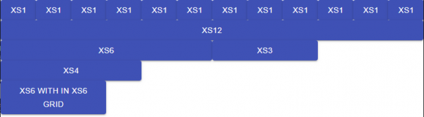
Grid can be a container, or item , or both, and each grid has 12 equally divided columns on the screen. If the next grid did not fit on the 12-column row, it will start a new row like the example shown below.
Here is how could it looks like:
import React from 'react';
// import './App.css';
import {Grid, Button} from "@material-ui/core";
import Header from "./Header";
import Content from "./Content";

function App() {
    return (
        <div className="App">
            <Grid container direction={"row"}>
                <Grid item xs={1}>
                    <Button fullWidth={true} color="primary" variant={"contained"}>xs1</Button>
                </Grid>
                <Grid item xs={1}>
                    <Button fullWidth={true} color="primary" variant={"contained"}>xs1</Button>
                </Grid>
                <Grid item xs={1}>
                    <Button fullWidth={true} color="primary" variant={"contained"}>xs1</Button>
                </Grid>
                <Grid item xs={1}>
                    <Button fullWidth={true} color="primary" variant={"contained"}>xs1</Button>
                </Grid>
                <Grid item xs={1}>
                    <Button fullWidth={true} color="primary" variant={"contained"}>xs1</Button>
                </Grid>
                <Grid item xs={1}>
                    <Button fullWidth={true} color="primary" variant={"contained"}>xs1</Button>
                </Grid>
                <Grid item xs={1}>
                    <Button fullWidth={true} color="primary" variant={"contained"}>xs1</Button>
                </Grid>
                <Grid item xs={1}>
                    <Button fullWidth={true} color="primary" variant={"contained"}>xs1</Button>
                </Grid>
                <Grid item xs={1}>
                    <Button fullWidth={true} color="primary" variant={"contained"}>xs1</Button>
                </Grid>
                <Grid item xs={1}>
                    <Button fullWidth={true} color="primary" variant={"contained"}>xs1</Button>
                </Grid>
                <Grid item xs={1}>
                    <Button fullWidth={true} color="primary" variant={"contained"}>xs1</Button>
                </Grid>
                <Grid item xs={1}>
                    <Button fullWidth={true} color="primary" variant={"contained"}>xs1</Button>
                </Grid>

                <Grid item xs={12}>
                    <Button fullWidth={true} color="primary" variant={"contained"}>xs12</Button>
                </Grid>
                <Grid item xs={6}>
                    <Button fullWidth={true} color="primary" variant={"contained"}>xs6</Button>
                </Grid>
                <Grid item xs={3}>
                    <Button fullWidth={true} color="primary" variant={"contained"}>xs3</Button>
                </Grid>
                <Grid item xs={4}>
                    <Button fullWidth={true} color="primary" variant={"contained"}>xs4</Button>
                </Grid>

                <Grid item container xs={12}>
                    <Grid item container xs={6}>
                        <Grid item xs={6}>
                            <Button fullWidth={true} color="primary" variant={"contained"}>xs6 with in xs6 grid</Button>
                        </Grid>
                    </Grid>
                </Grid>
            </Grid>
        </div>
    );
}

export default App;
Container, Item
Usually grid as an item contains one child component, and grid as a component can contain as many grid children as possible.
xs, sm, md, lg, xl, and Break Point
Up to this point, we only use xs, but we can mixed it with other like bootstrap to create a responsive UI. The logic as follow:
If we have xl, and the width of the browser is >=1920 , xl will be used.
if we have lg, and the width of the browser is width>= 1280 and width <1920 , lg will be used.
if we have md, and the width of the browser is width>= 960 and width <1280, md will be used.
if we have sm, and the width of the browser is width>= 600 and width <960, sm will be used.
if we have xs, and the width of the browser is width>0, xs will be used.
The higher one has higher priority.
value         |0px     600px    960px    1280px   1920px
key           |xs      sm       md       lg       xl
screen width  |--------|--------|--------|--------|-------->
range         |   xs   |   sm   |   md   |   lg   |   xl
Copy from https://material-ui.com/customization/breakpoints/
Spacing
Spacing is about the space between each grid. It can be set from 1 up to 10. The default one is 1 = 8 pixels, but it is all up to the theme applied.
<Grid container justify="center" spacing={1}>
...
</Grid>
Flexbox
Gird use flexbox for css, so it behave exactly like flexbox.
- direction row, reverse, column, column-reverse
- justify flex-start, center, flex-end, space-between, space-around, space-evenly
- alignItems flex-start, center, flex-end, stretch, baseline